Lesson Pro:
Two Audiences, One App, One Brand
The challenge:
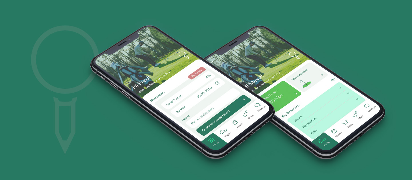
Most apps are built for one type of user. Lesson Pro is built for two, golf professionals managing a business, and the players they coach. Every page, every feature, every line of copy had to work twice: once for a coach thinking about diary management and income, and once for a player thinking about their swing.
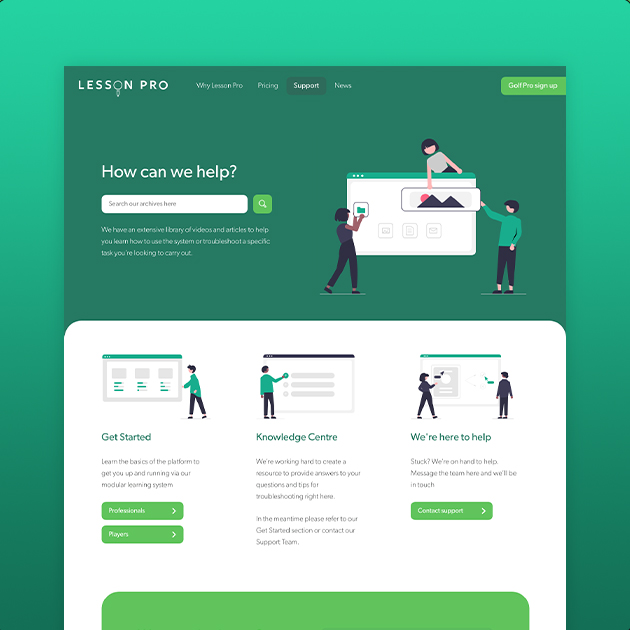
Brown + Cooper created the Lesson Pro brand from the ground up, then built a website capable of holding that dual conversation without either audience feeling like an afterthought.
Deliverables:
Brand Identity
Application UI and UX
Website Design
Website Development

Building for both sides of the range
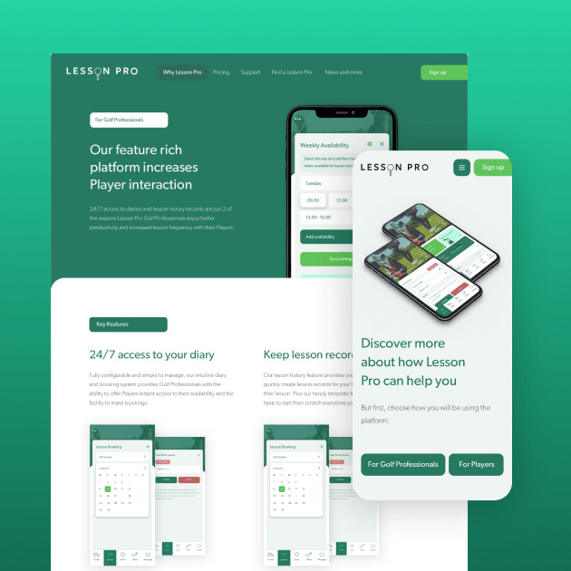
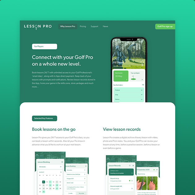
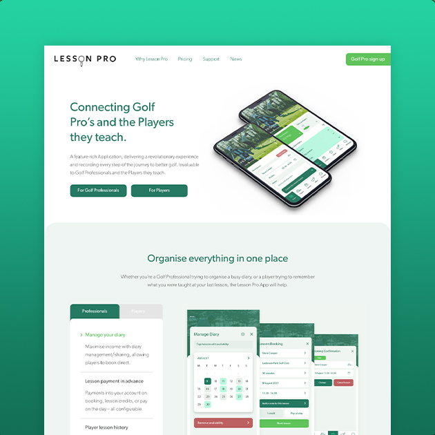
The site’s navigation splits early and clearly, ‘Why Lesson Pro leads straight into separate paths for Golf Professionals and Players’ but the visual identity had to hold both together. One brand, two conversations, no confusion about which app someone was looking at.
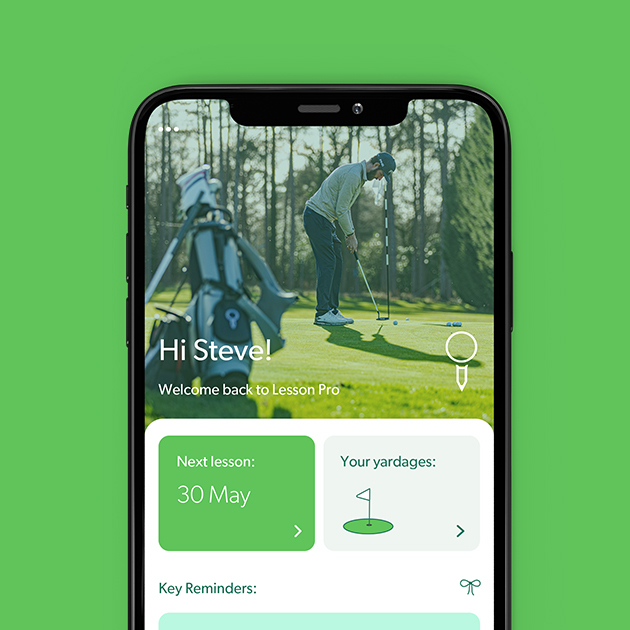
Feature call-outs were built to run in parallel: diary management and payment tools sit alongside lesson history and yardage tracking, each written in the voice of the person using it rather than a single generic tone trying to cover both.
Built to convert on both fronts
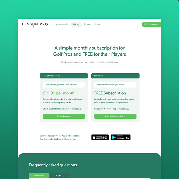
Two calls to action run through the site rather than one: professionals are pushed toward booking a demo, players are pushed toward downloading the app. Getting that split right, without either path feeling secondary, was as much a UX challenge as it was a design one.